My Role: UX/UI Designer
Summary
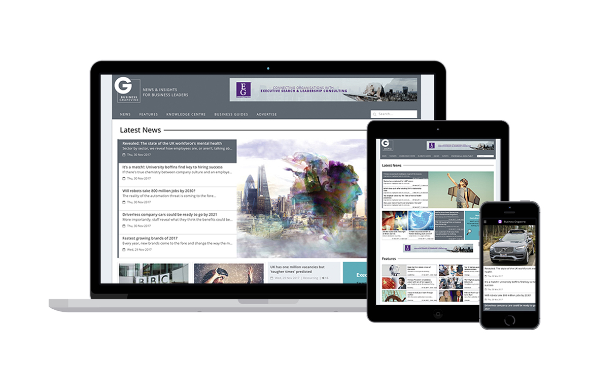
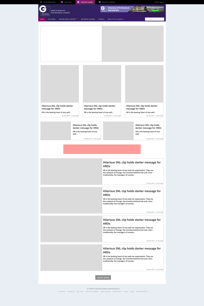
With over 100,000 page impressions per month, Business Grapevine is a highly successful news website for business leaders.
The Brief
Re-design the current website, looking at ways of improving the user experience.
Goals
Engage the users with a new layout, streamline content and find ways of increasing engagement below the fold/cold zones.
Research
At the start of the process, I decided to review industry competitors to see:
- How their sites were designed.
- Website navigation used.
- UI design (colour/typography/content).
- Information architecture.
- User experience.
All findings were collated in a table, so I could see trends and carry out a comparison.
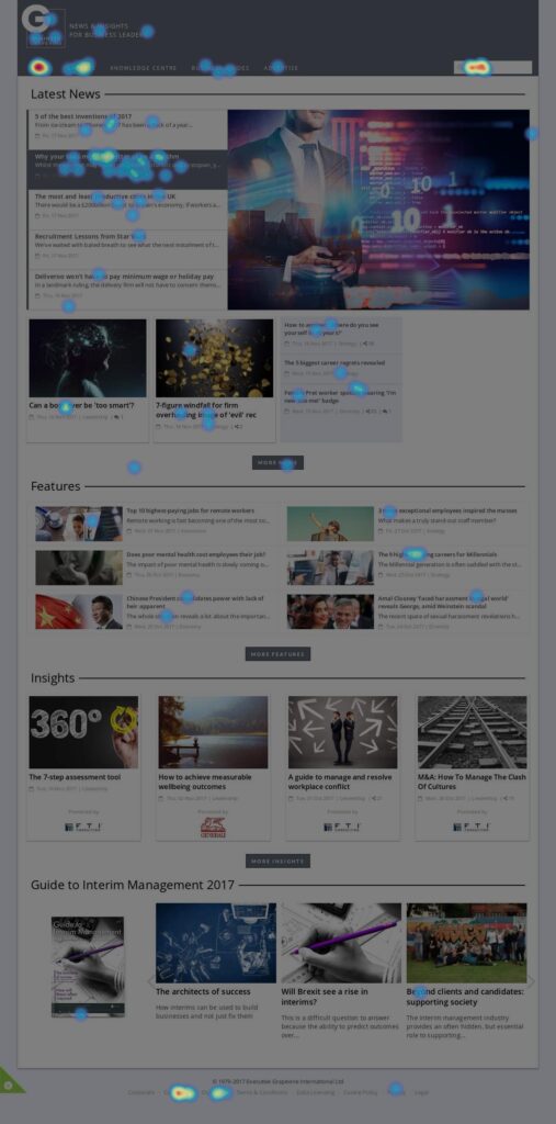
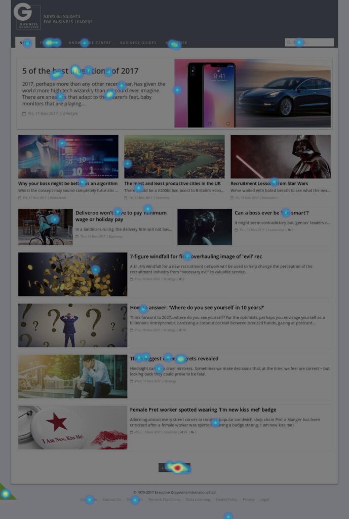
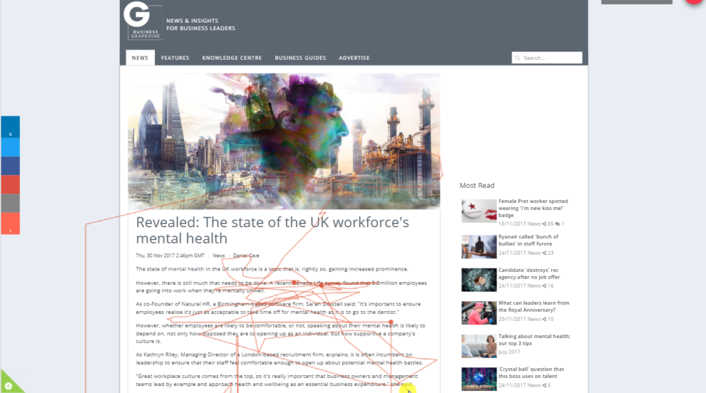
Heat maps & User videos
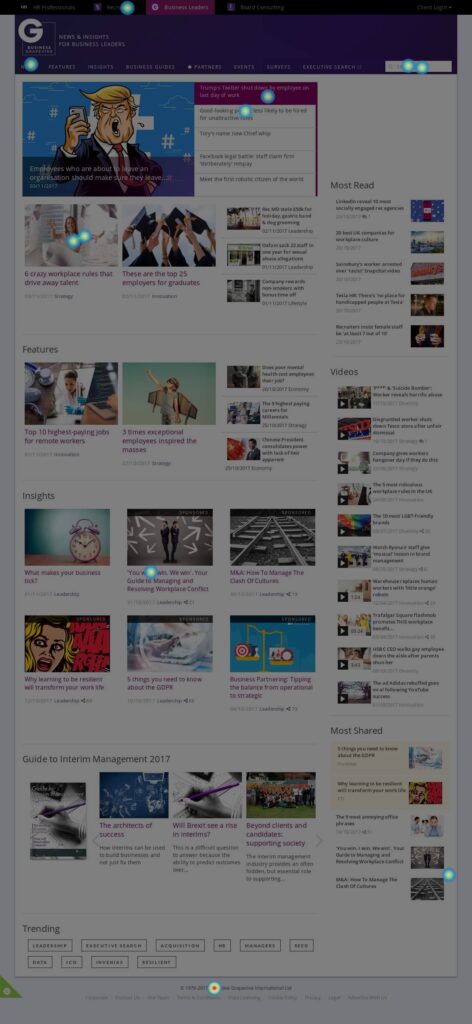
I wanted to understand from a user’s point of view what works and what doesn’t work on the website. To gain this insight I deployed hotjar across the website.
This tool enabled me to review videos of users using the site and assign heat-maps to key website pages.
Reviewing the heat-maps generated, gave me valuable feedback into where user engagement is hot and areas on the website where engagement is cold.
Sketching / Paper prototype
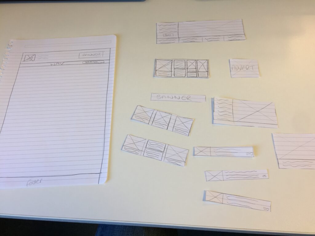
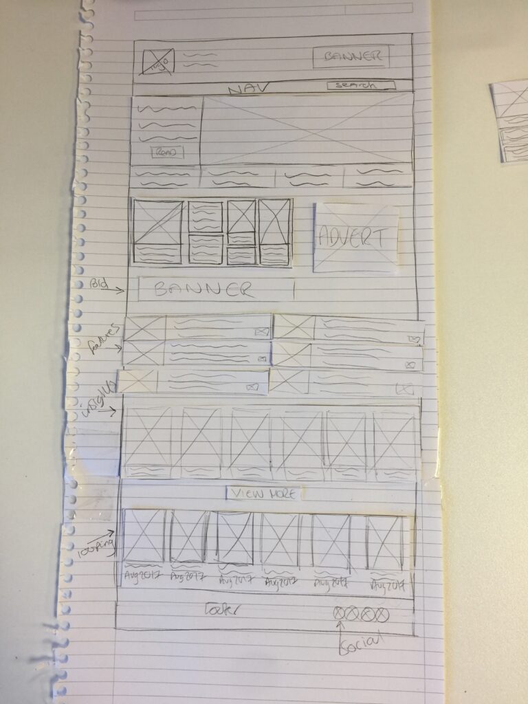
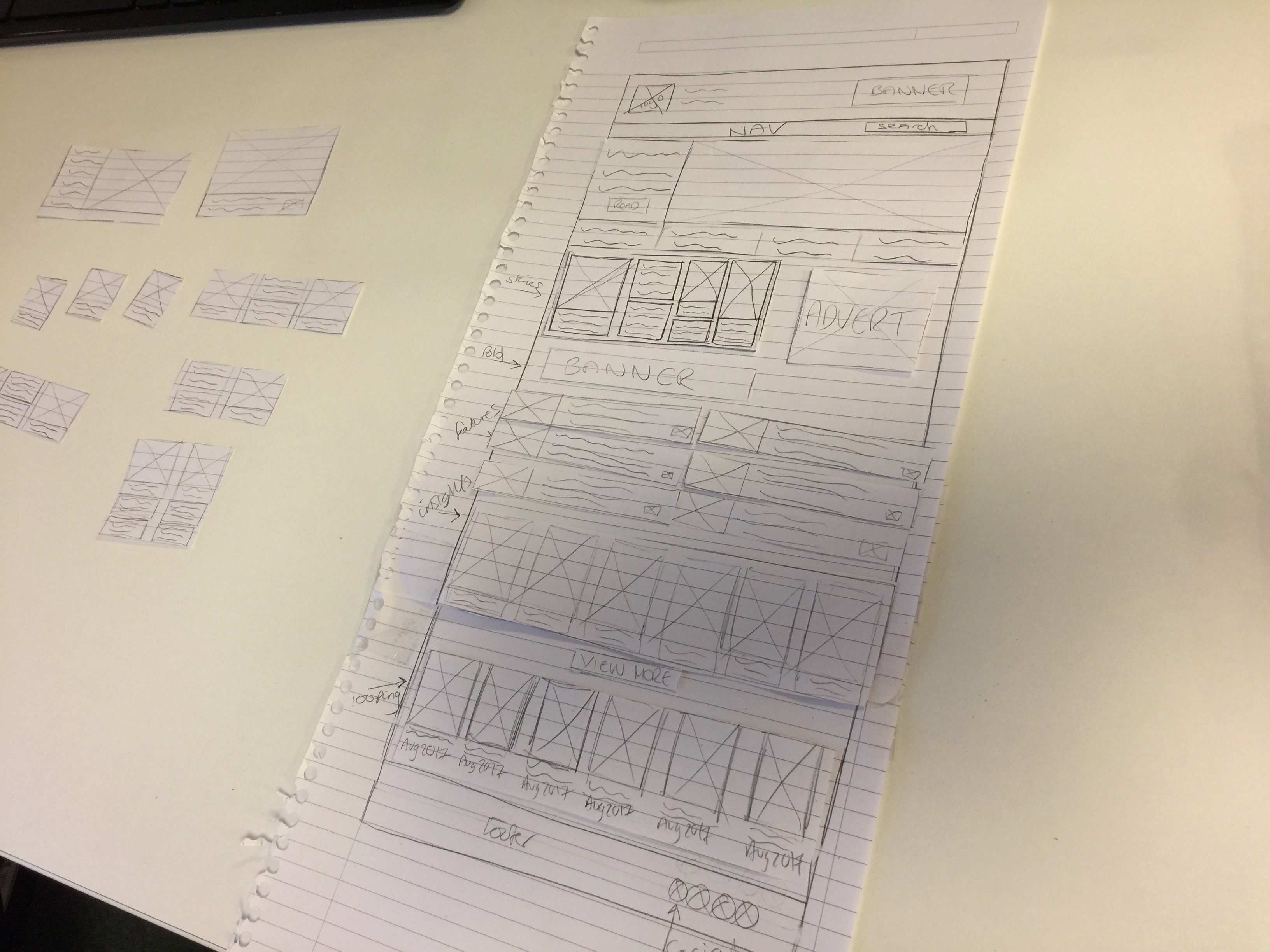
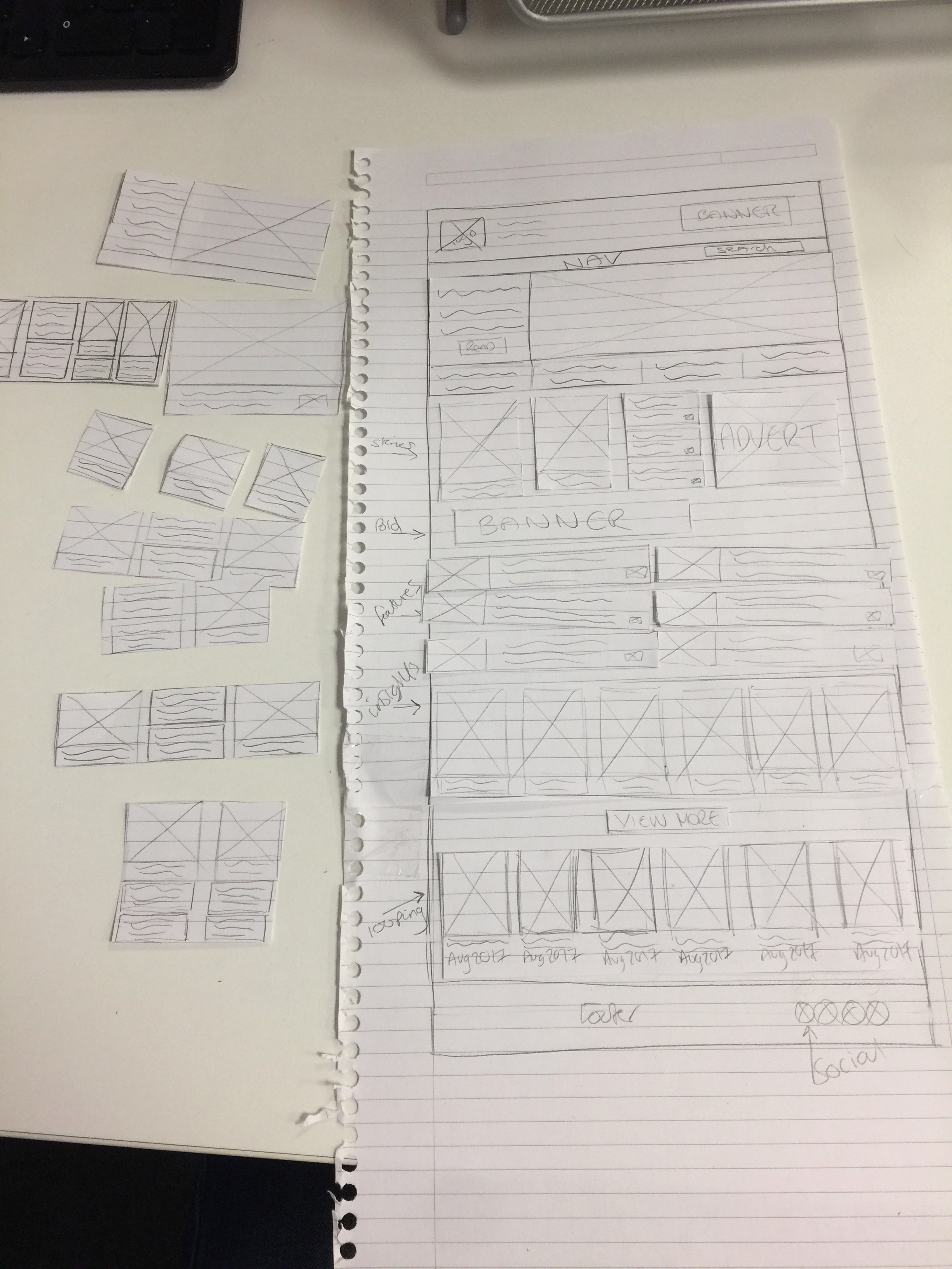
Armed with research and user insight, I started sketching web page layouts. From there I moved onto paper prototyping, which allowed me to test multiple layouts efficiently. I then tested these prototypes with users to gain further insight.
Using this process allowed me to quickly win/fail and refine my designs further before making them digital.
Card sort
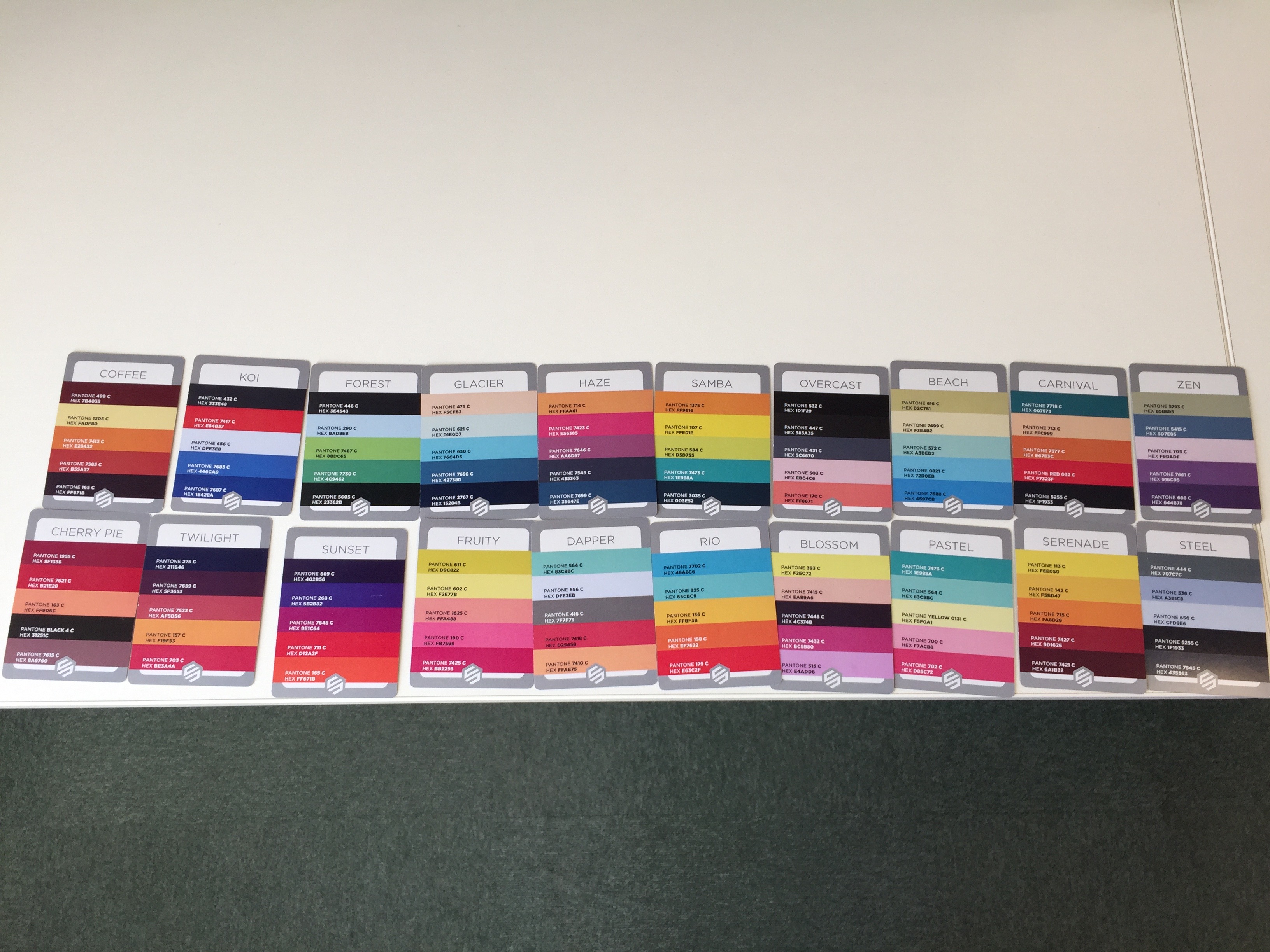
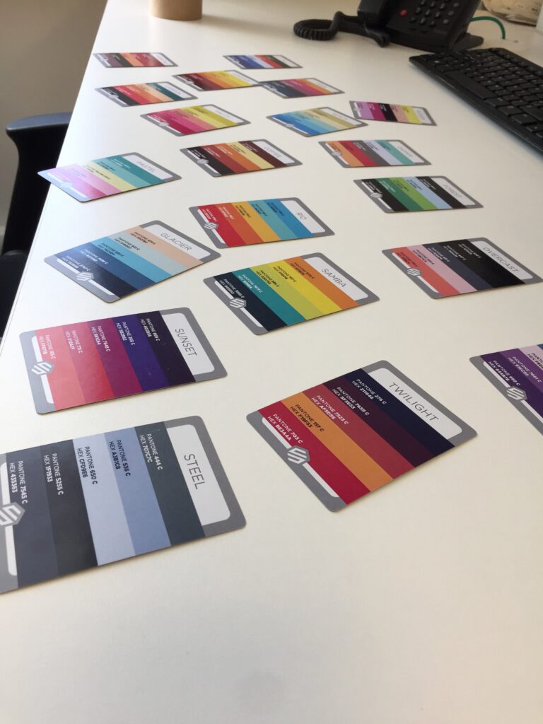
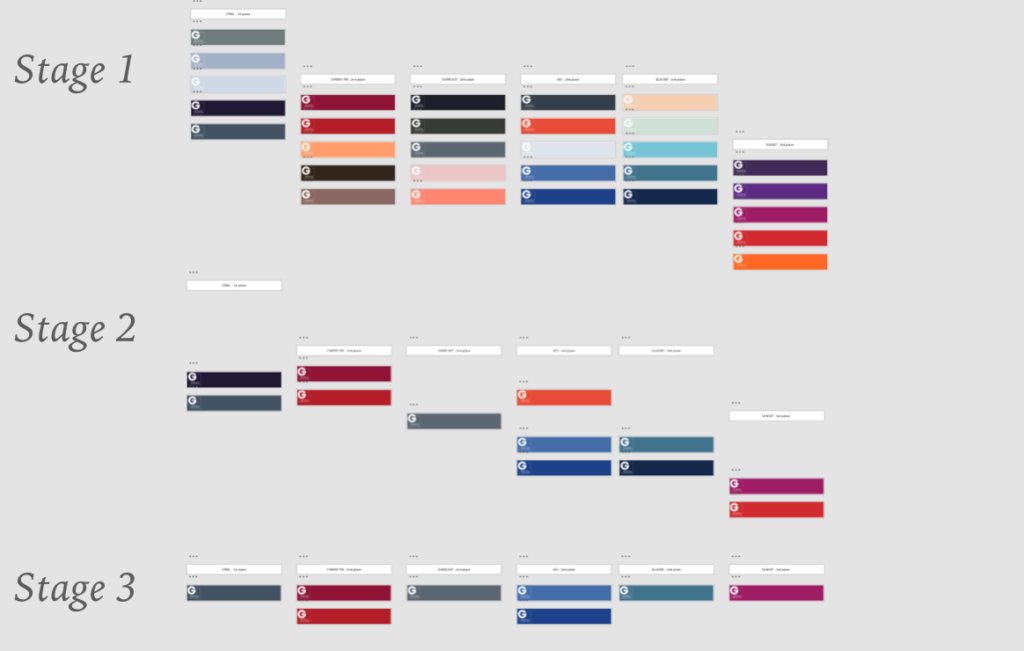
Using a colour card deck (storm deck), I interviewed multiple users asking their opinion on what colour they felt would work well for the new website and why. Results were collected in Excel and analysed. Results (above) show the process of elimination from stage 1 to 3. This process resulted in eight colour options to take forward.
Digital Wireframes
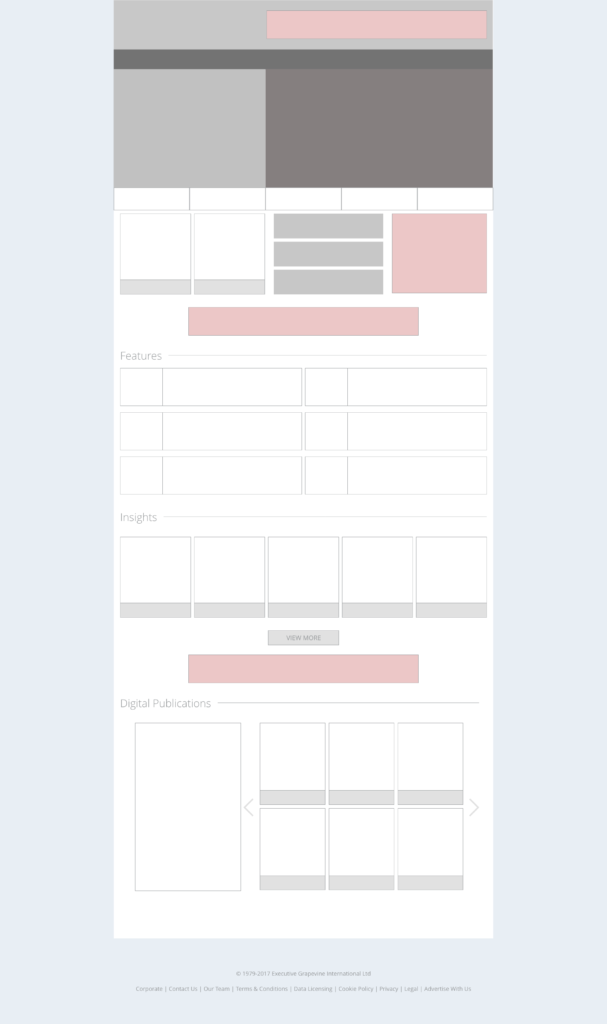
Building on the previous stages of the process, I was able to mockup digital wireframes for the website.
Hi-fi Mockups / Prototype
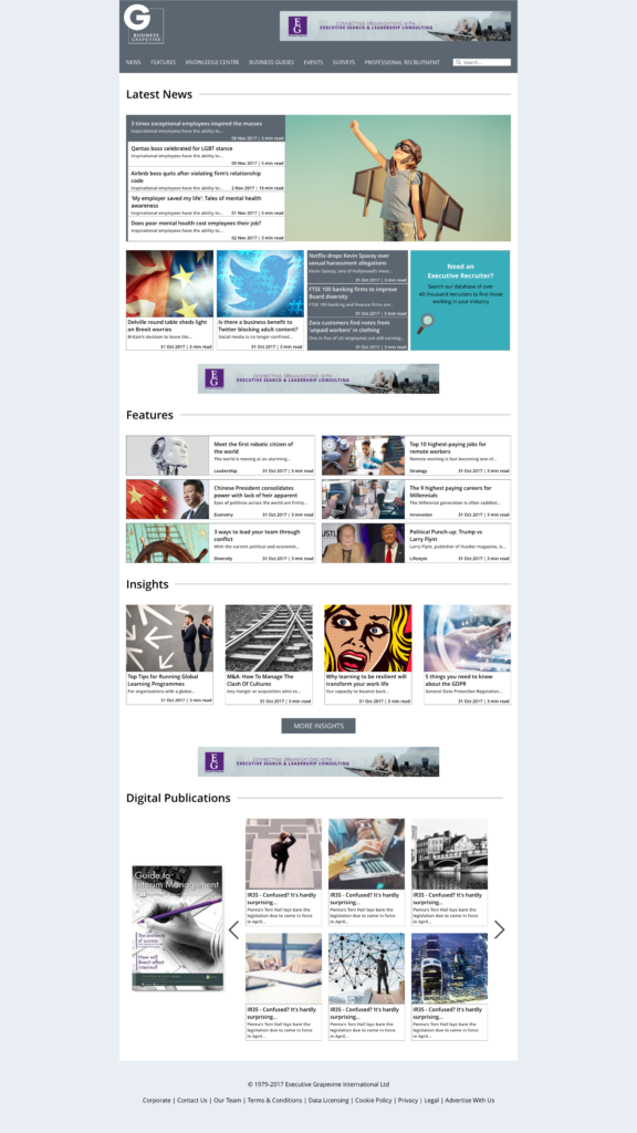
I was now at the stage where giving more context to my users would be valuable. So I added real site content and created a digital prototype. This allowed users to interact with the site as if it was already developed. Comments could be collected easily through a design portal and again based on user feedback, I continued to refine my design for the users.
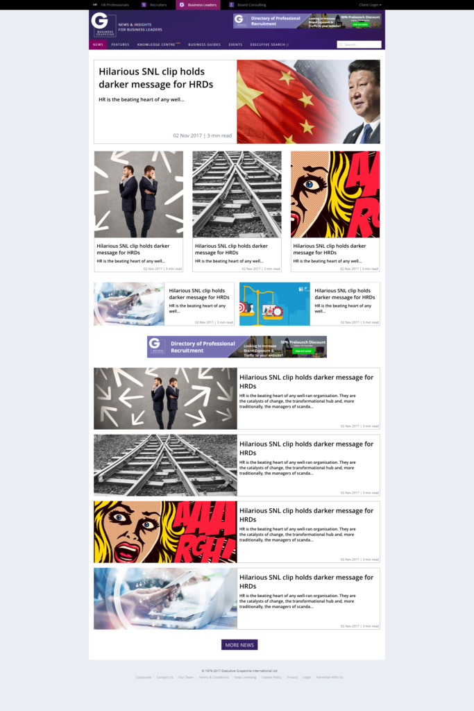
Time to launch

With sign-off given, I worked with the development team handing over my digital prototype and ensuring at each sprint that my design was implemented in-line with the specification.
Post launch
- User engagement and time spent on the website has increased. This is reflected in the heat maps/videos that show increased usage across pages that were originally cold.
- Content has been streamlined.
Whats next????

- Continue to refine and test the website.
- Usability testing with more users.
- Have a cuppa!