My Role: UX Designer
Summary
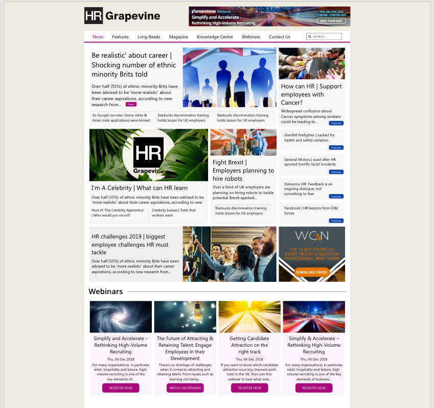
With over 500,000 page impressions per month, HR Grapevine is a highly successful news website for HR leaders.
The Brief
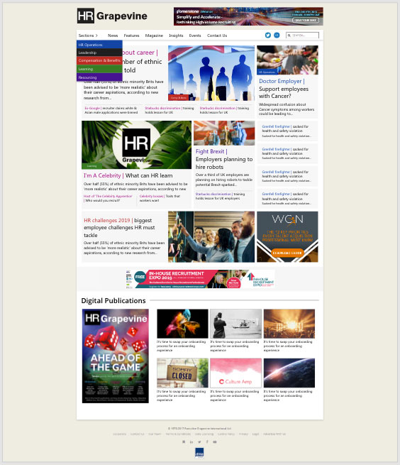
Re-design the current website, looking at ways of improving the user experience.
Kick-off meeting held with key stakeholders, to establish goals as follows:
Goals
- Increase the user’s time on the website.
- Engage the users with a new home page layout.
- Find new ways to increase traffic across different types of content.
- Make it easier for users to see the different types of content.
- Review the current navigation and make it easier for the user to navigate the website.
- Reduce the length of the home page.
Research
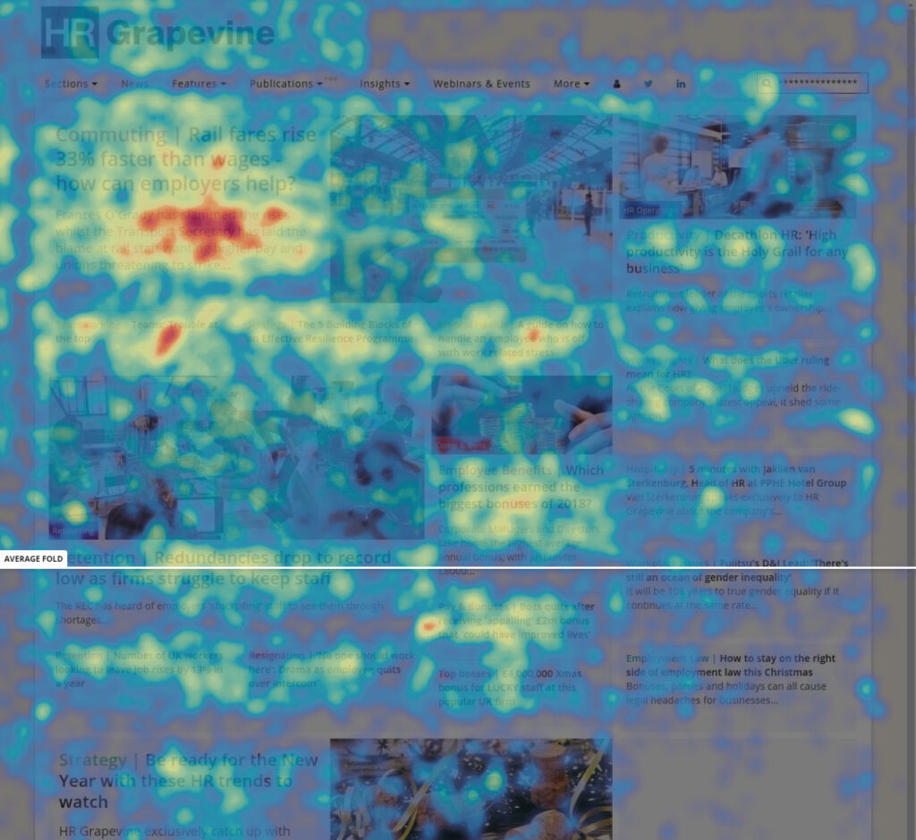
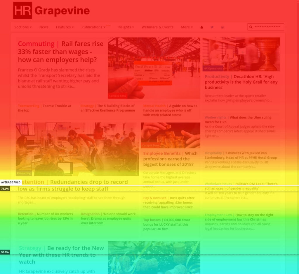
Heat maps & User videos
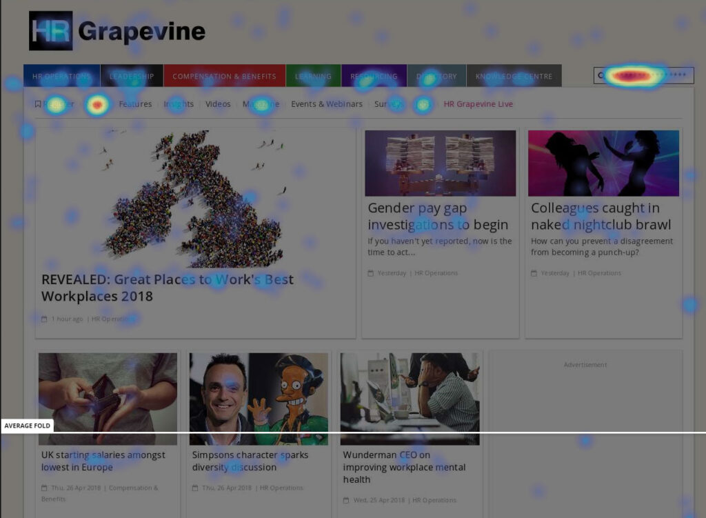
Using Hotjar and Google analytics I was able to understand very quickly how users were behaving on the current website.
Reviewing the heat-maps generated, gave me valuable feedback into where user engagement is hot, and areas on the website where engagement is cold.
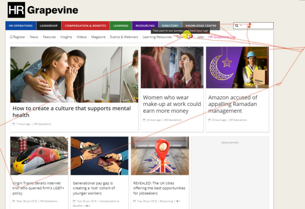
Usability testing
Establishing department goals
Based on internal stakeholder meetings, I put together a requirements document on what the company wanted to know about our users. Next I created a discussion guide which was shared with the various teams to ensure everyone was involved in the process and could provide their input.
Recruiting users
Using Hotjar, I recruited users via poll pop ups on the website. Once a user registered their interest they were emailed a survey which contained more in-depth questions to verify if they were of the correct audience.
I then reviewed the completed surveys and made contact with the users to schedule in the usability tests.
User testing
Usability tests were conducted both remotely and in person.
Listening to the users whilst testing the existing website, gave real insight into their context, environment, when/why they visit the site and their behaviors. I could now really empathize with how our users felt when using our solutions.
Outcome
Findings were collated and all interviews were recorded.
Consistent issues/behaviors across all interviews have been identified.
Affinity mapping
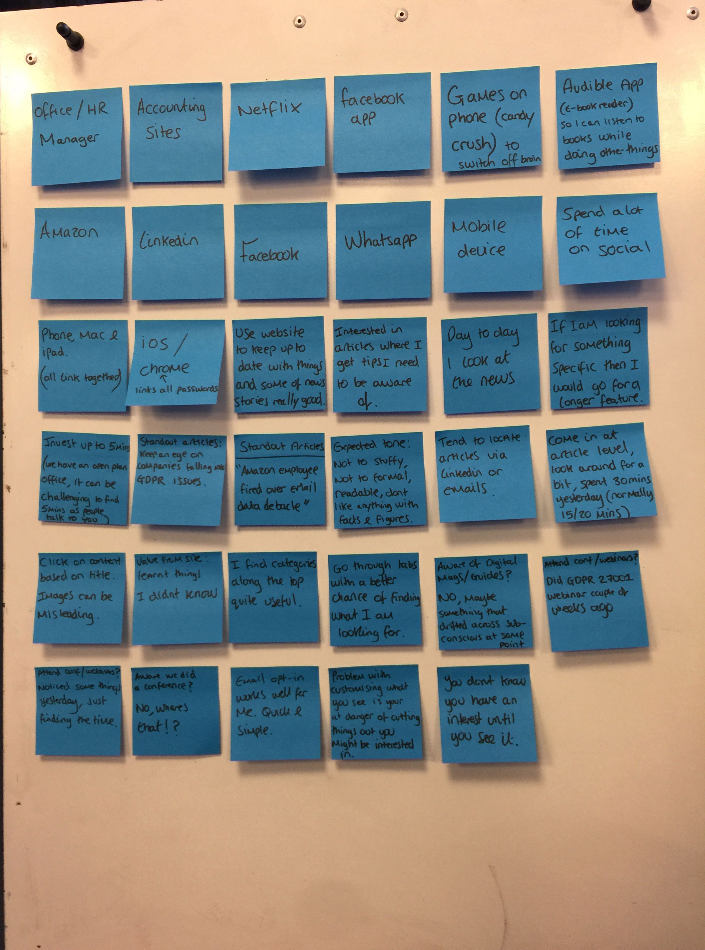
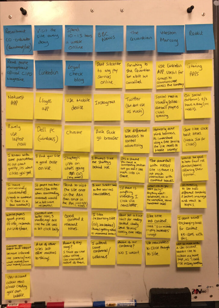
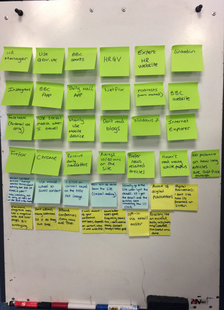
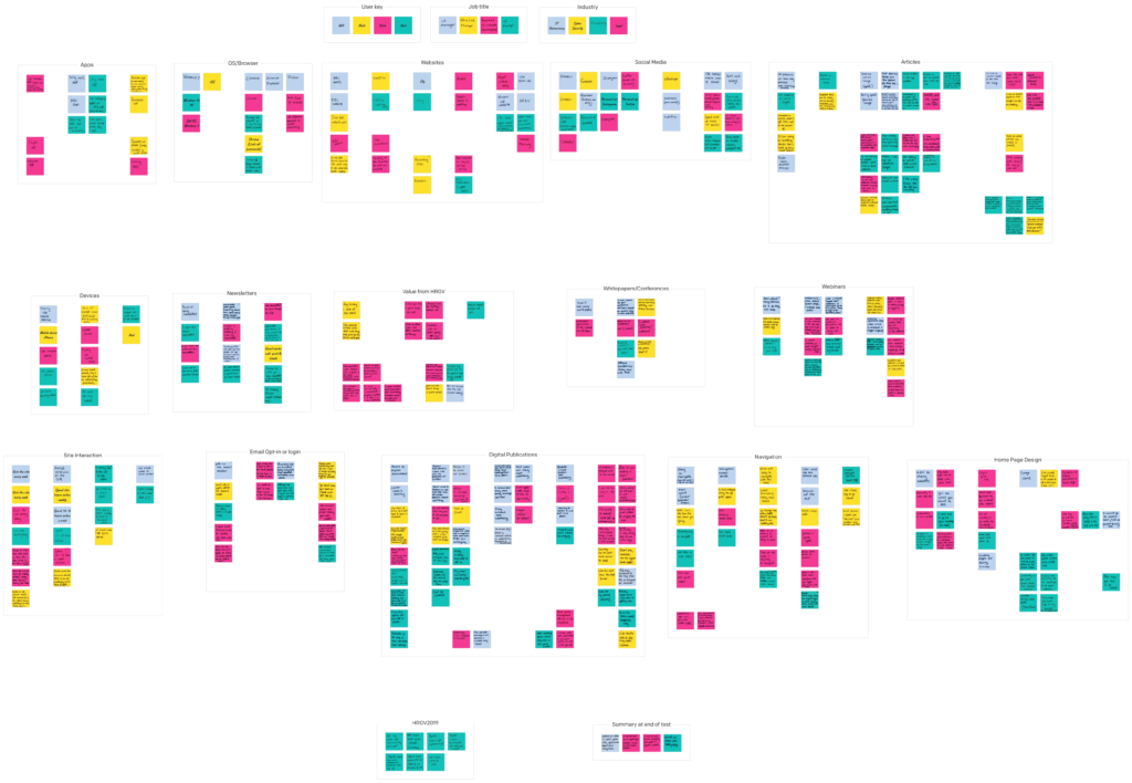
Findings were documented on post-its. Once completed I digitized them via an app and grouped post-its by common themes. Trends started to appear.
Persona

Based on the research findings a persona was created.
Name: Steven
Age: 38
Job title: HR Manager
About the user:
Steven has worked in the HR industry for 5+ years and travels all over the country for a large international company. Steven is responsible for a workforce of 150+ employees and he works alongside HR directors to deliver strategic goals to meet people targets of the organisation. Steven is currently undertaking HR exams to help him progress in his career.
Behaviours & habits:
- Spends 15-20 hours online a week.
- Visits Apple News, BBC News, Sky News, The Guardian & HR Grapevine daily.
- Uses mobile device, as he travels a lot.
- When using a laptop, preferred browser is Chrome (saves passwords in one place).
- Uses LinkedIn for work and keeps other social networks for personal use (Facebook/Instagram/Twitter).
- Attends some webinars/events.
Goals:
- To stay up to date with HR news / processes / what’s going on inside other companies.
- Continue to develop and progress in career.
Frustrations:
- Has very limited time.
- Doesn’t like click bait titles on websites.
- Having to provide personal details again and again on websites.
UX document
Findings were documented and shared with the company to provide key insights into our audience’s behavior. The document also included recommendations for website changes.
With key stakeholders signing-off, I could proceed to the next stage of the project.
Sketching
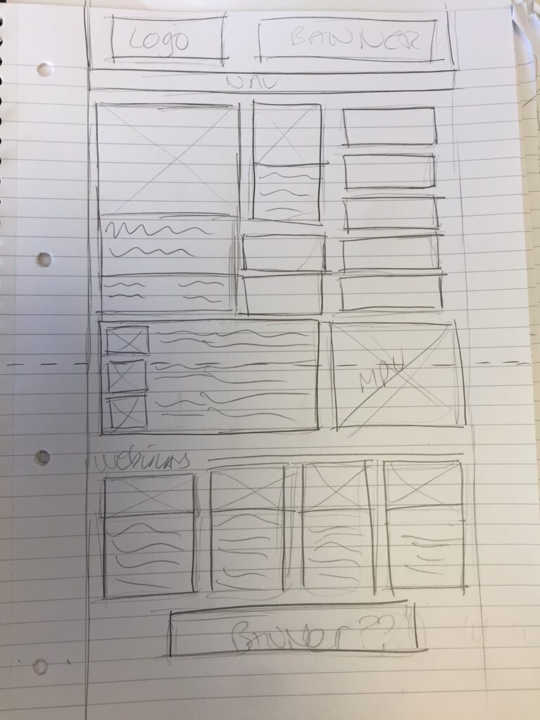
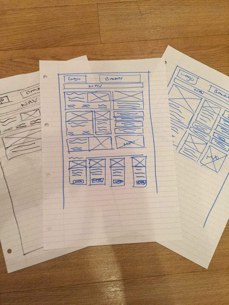
Based on my findings I sketched some new layouts and tested them with internal stakeholders.
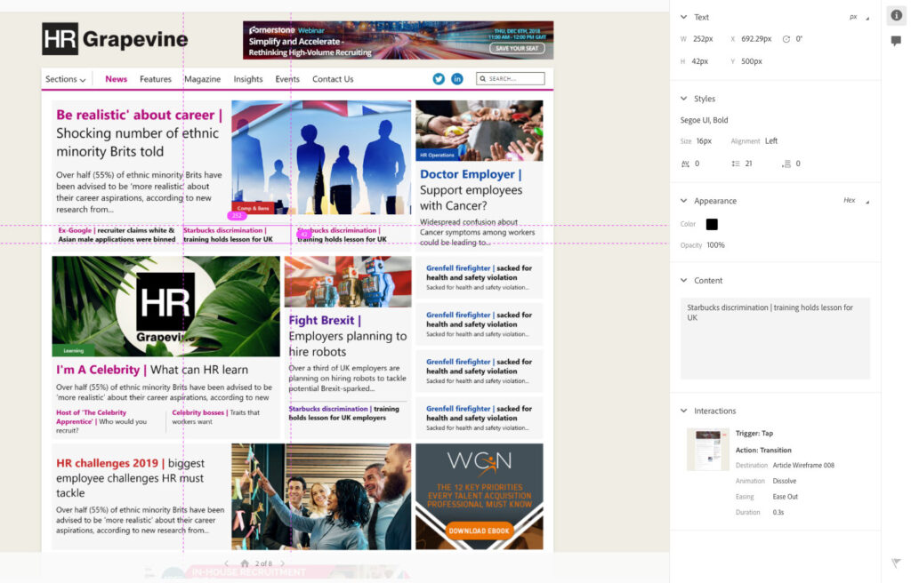
Digital Wireframes
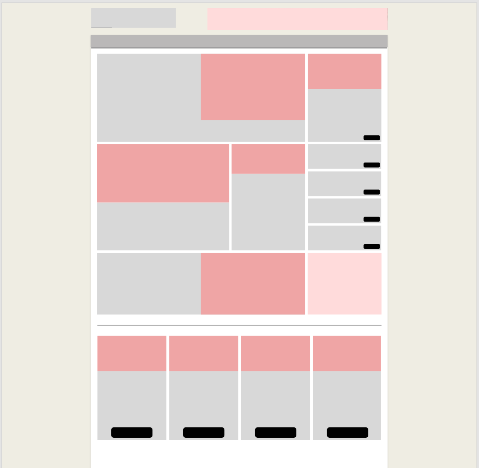
Building on the previous stages of the process, I was able to mockup digital wireframes for the website.
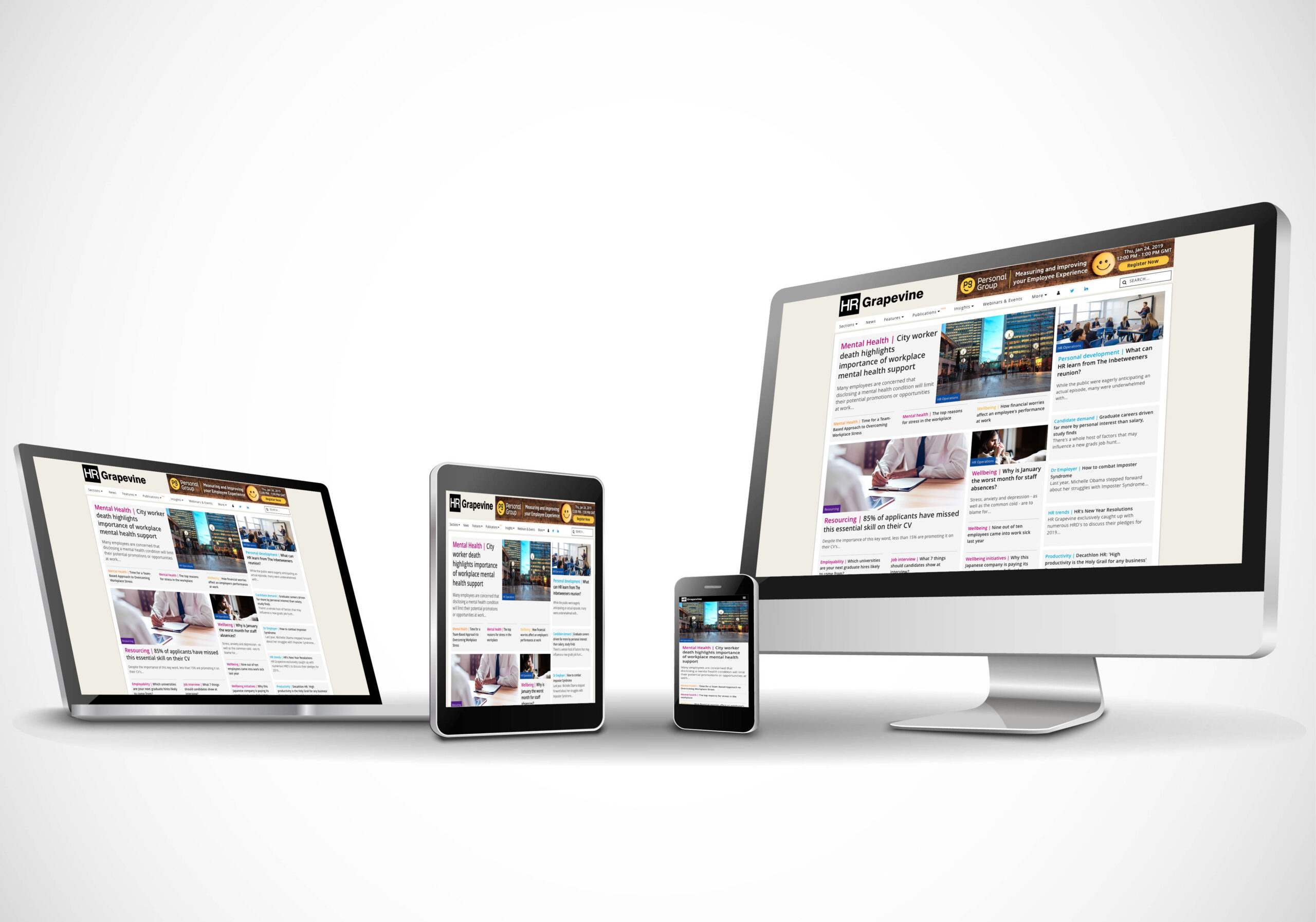
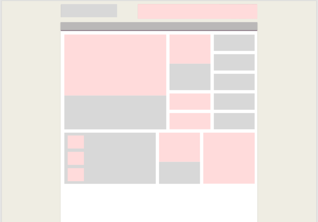
Hi-fi Mockups / Prototype
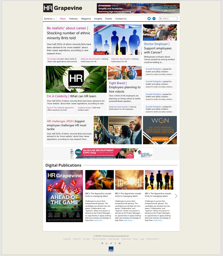
Going higher fidelity I added real site content and created digital prototypes, testing them with internal/external stakeholders.
I continued to refine my designs based on feedback.
Once sign off was confirmed, I could prepare the designs for the development team.
Development Handover
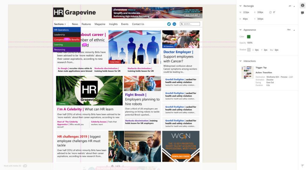
During the build stage I worked closely with the developers. I handed off the design specifications via Adobe XD, a tool which provides a design portal for developers with everything they need (assets/colours/font sizes etc).
Communication with the audience
I worked closely with the marketing/editorial teams on communications regarding the new website improvements. Thanking the audience for their involvement and providing details on the website changes.
Newsletter email templates were also updated to reflect the new design for consistency.
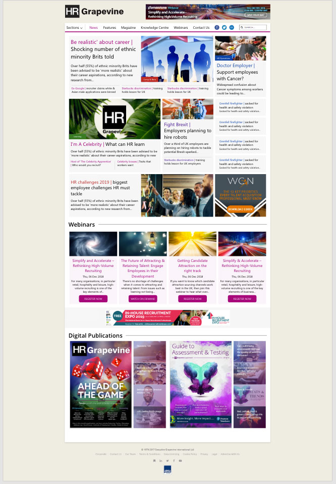
Post launch
So did we meet our goals?
Yes, we did!
- Working closely with our internal analysts, bounce rate has reduced by around 45%.
- Heatmap activity has increased.
- Users are now getting to other areas of the website with ease due to the simplified navigation.
- Readers are accessing different types of content across the website, so overall time on site has increased.
- Home page length has been reduced, showcasing more content above the fold.
- Content type labels have been added to the design, so users on the website can identify content types easier.
Audience feedback shortly after the re-design went live:
“Just wanted to let you know that the updated site looks great. Feels thoroughly modern and refreshed, and definitely easy to navigate. Kudos to your marketing and web teams for the work”
HR Grapevine user
“Looks really good, great job. Navigation to content especially is excellent”
HR Grapevine user
Next steps
Continue to refine the design based on user feedback with further usability testing.