My Role: UX/UI Designer
Summary
Executive Grapevine’s leading HR annual conference held in London, brings together industry leaders for a day of innovative talks, debates and networking opportunities. With top speakers from Starbucks, Virgin Media, L’Oreal and many others, it’s an insightful day for HR professionals.
The brief:
Design a registration app to work on the iPad. The design must assist delegates attending the conference with registration, include the insight sessions they will attend and update all information into a backend database, so staff can review details on the day.
Goals:
Create an experience that is easy to use. The user journey must involve minimal clicks from the users, whilst showcasing sponsors. The process of registration must be quick.
Basic user flow
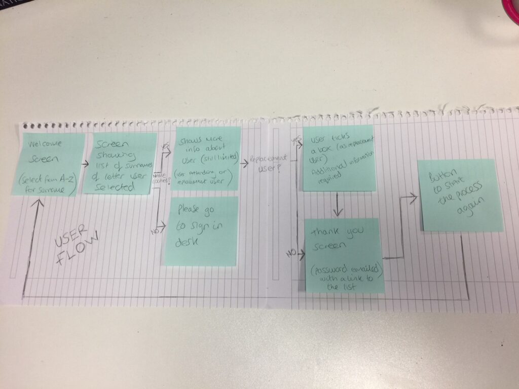
I decided to sit down with key stakeholders to understand the event registration process. I then drafted a user flow, showing the key journeys the user could take whilst using the app.
My aim was to reduce the level of mental effort required to carry out this registration task with as few clicks as possible.
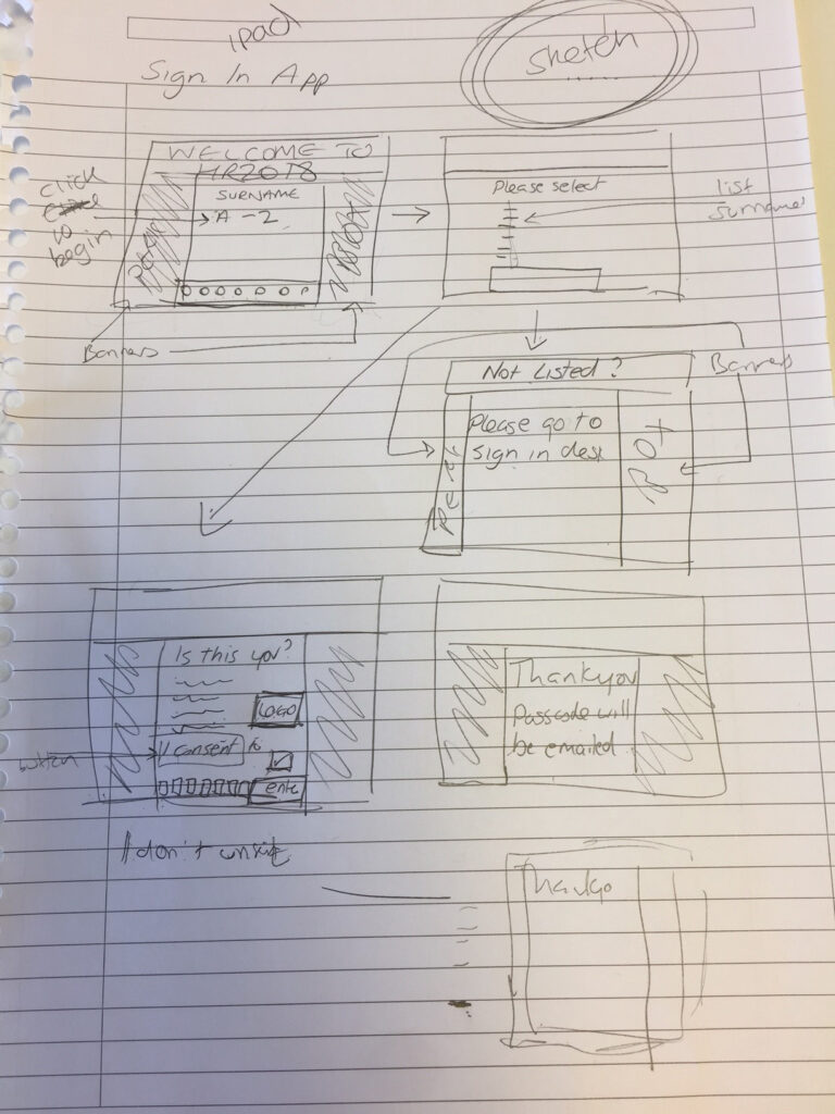
Sketching
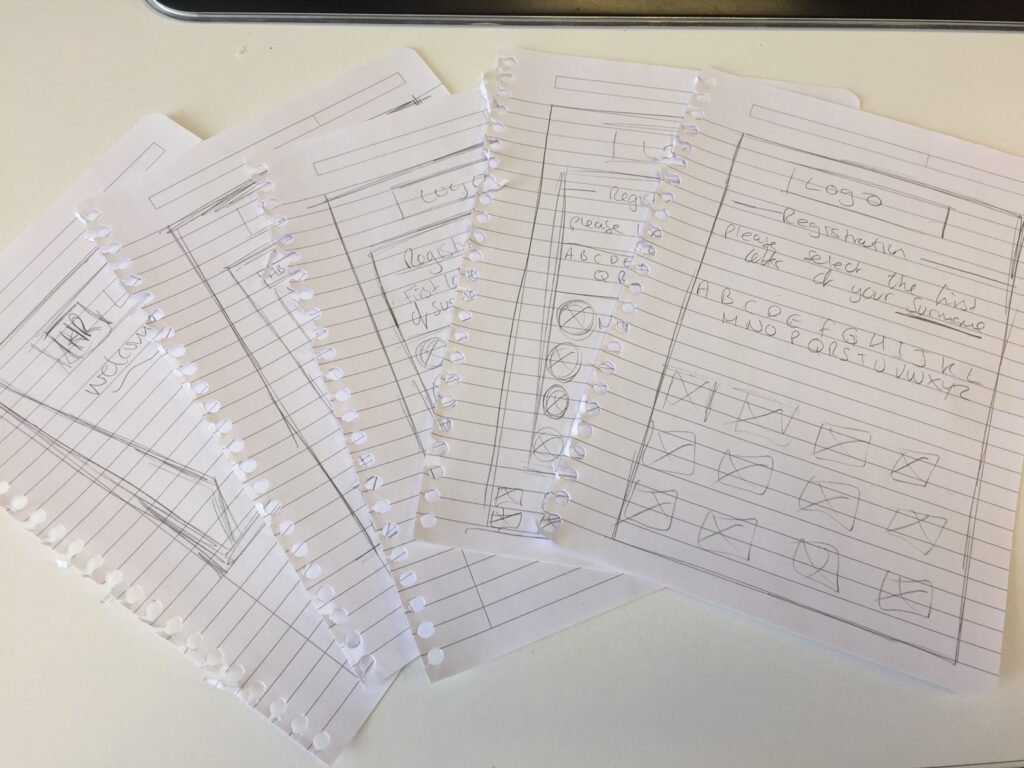
Based on the information gathered from the stakeholders, I started sketching potential layouts.
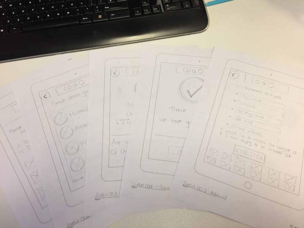
From there I moved onto using tablet mockup templates, these allowed me to test multiple layouts efficiently. I then tested these designs with users to gain further insights.
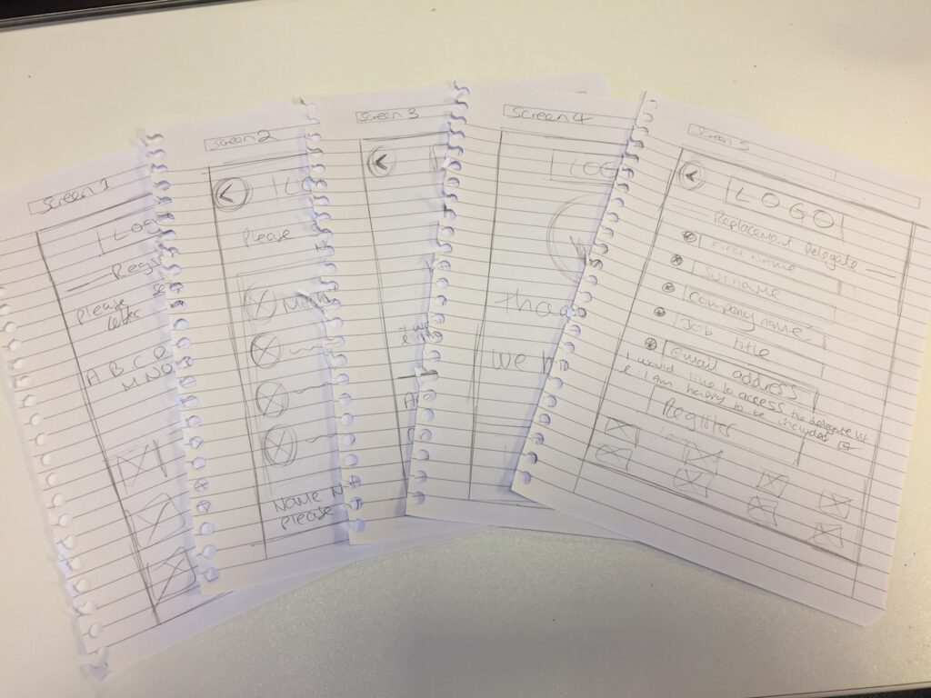
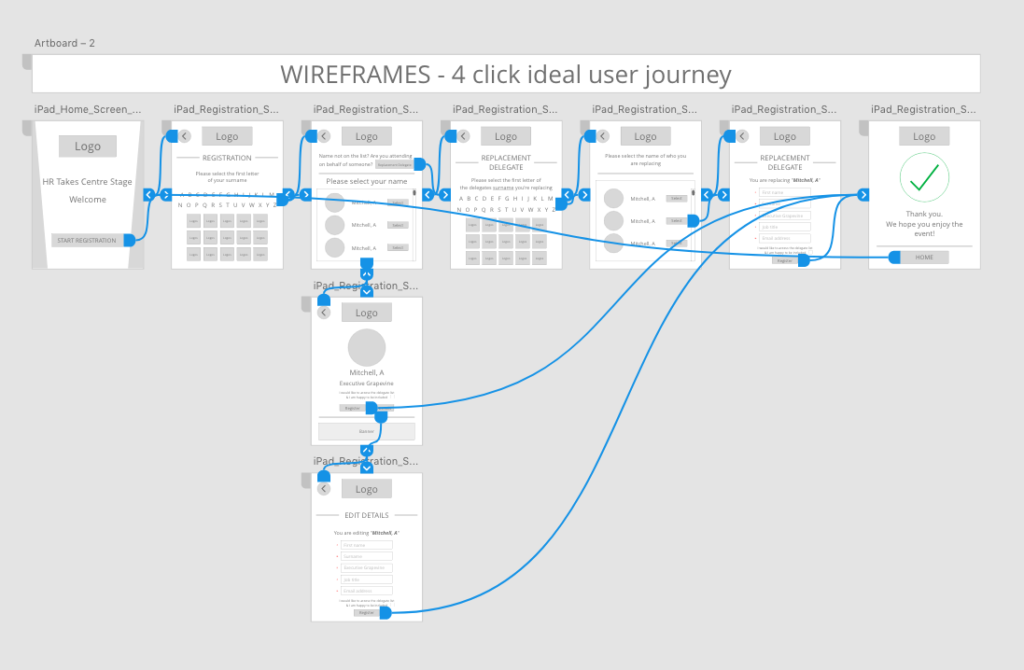
Digital Wireframes
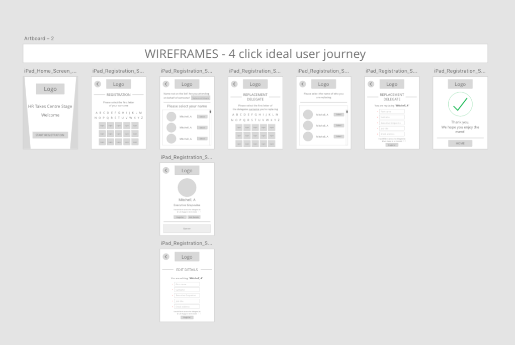
Turning the sketches digital.
Interactive Prototype
Making a clickable prototype to share with internal/external stakeholders for usability testing.

Usability testing
Round 1 User Feedback
Usability testing identified the following issues (user comments below):
- “Seeing the design in colour/with images would help understand where elements would go (e.g sponsors / logos).”
- “iPads will now be displayed within stands in landscape view.”
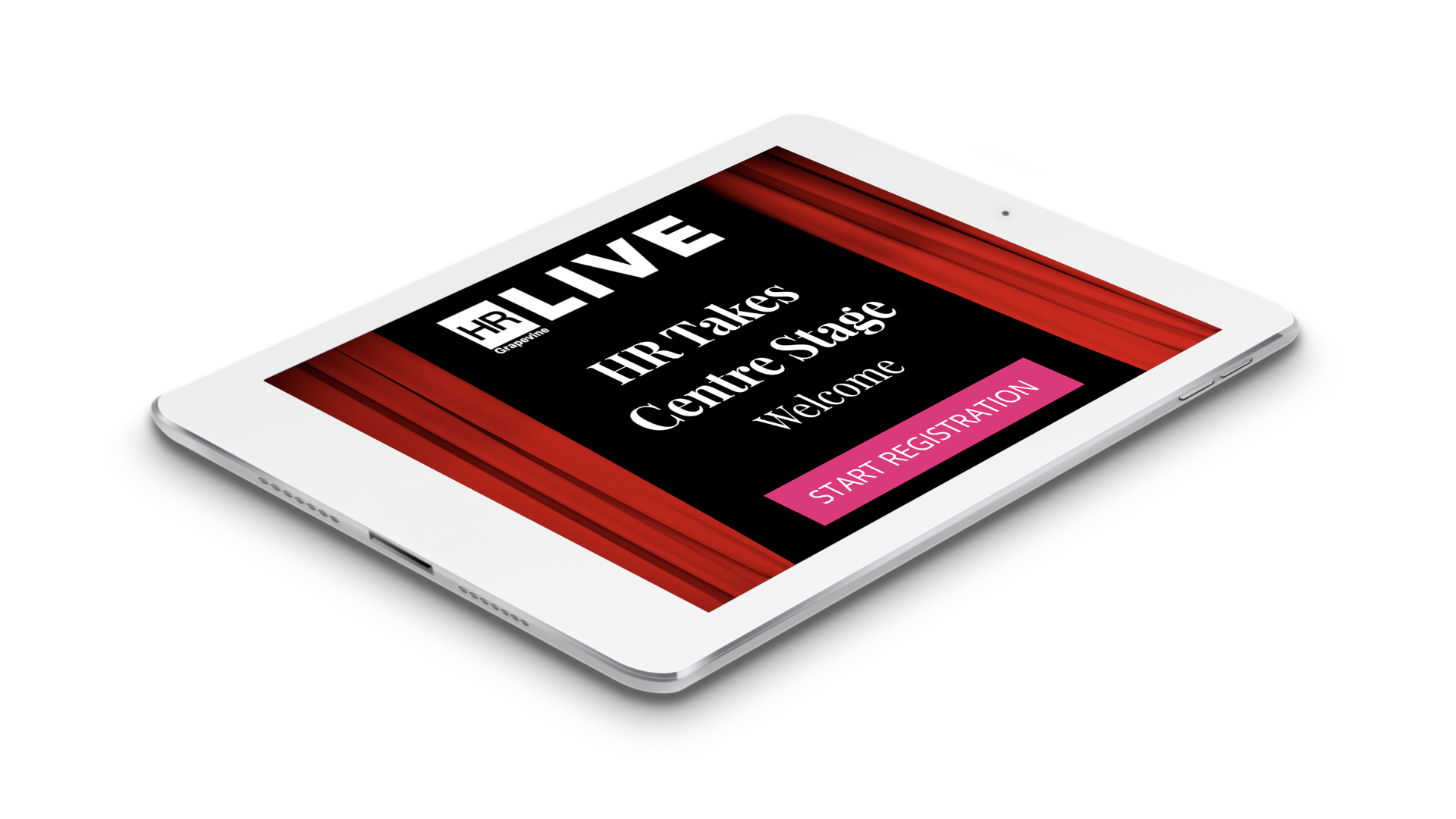
Version 2 Designs
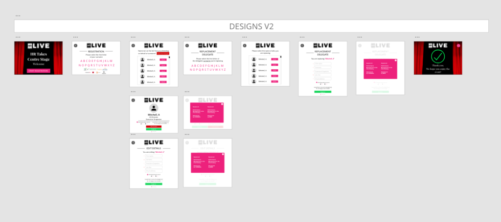
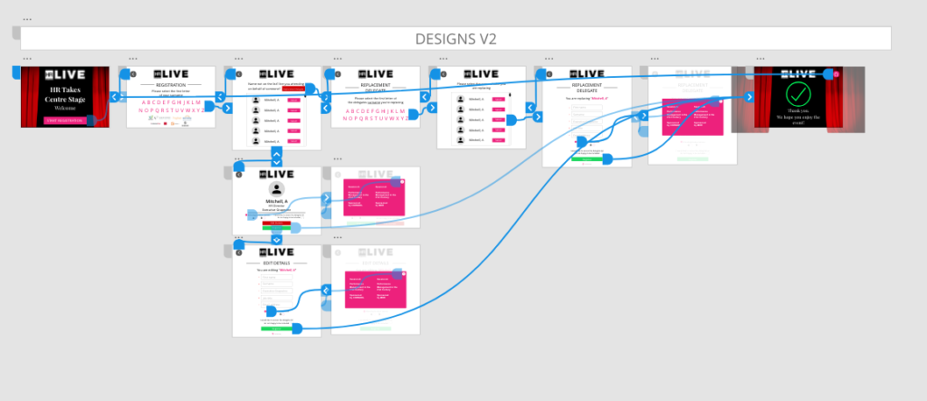
Taking onboard the feedback from users, I added colour/images to the design (in-line with the event theme) to give more context. I also adjusted the dimensions to showcase the design in landscape.
Round 2 User Feedback
Usability testing identified the following issues (user comments below):
- “How long does this process take, as I want to fill in my details and enter the conference as quickly as possible?”
Version 3 Design
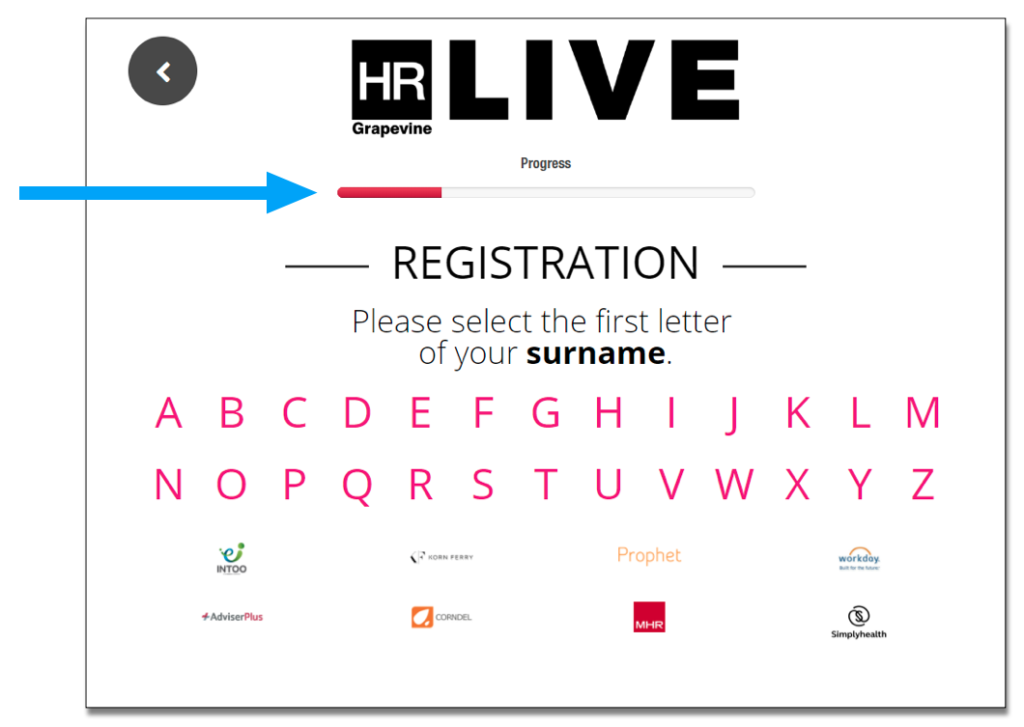
Taking onboard the feedback from users I decided to add a progress bar, showing the user how long they have left before completing the process. The progress bar changes colour, as the user completes each stage.
3, 2, 1 Launch!
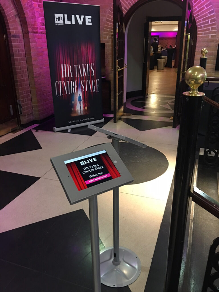
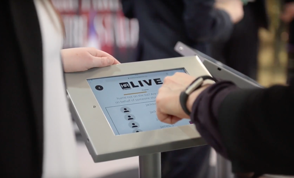
- Colleagues were trained on how to use the app and support delegates on the day.
- Sponsors were showcased on multiple screens for additional exposure.
- I worked with the developers as they added a database that captured the delegate information, so this could be reviewed during the event.
- The registration app was quick and caused no delays.
With this now completed, there was only one more thing to do…

Relax 🙂